Edge Hill’s story begins with courage.
Founded as the first non-denominational teacher training college for women, Edge Hill was born from a belief that education could – and should – change lives. At a time when opportunity was limited and voices were too often unheard, we chose a different path. We opened doors. We challenged expectations. We championed equity before it was widely accepted, and possibility before it was guaranteed.
That pioneering spirit has never left us.
From our suffragette roots to our role today as a modern, people-centred university, Edge Hill has always been shaped by those willing to move forward, even when it meant standing apart. Our history isn’t something we look back on with nostalgia; it’s something we carry with us. It’s the foundation of our commitment to put people first, to break down barriers, and to turn potential into possibility – and possibility into impact.
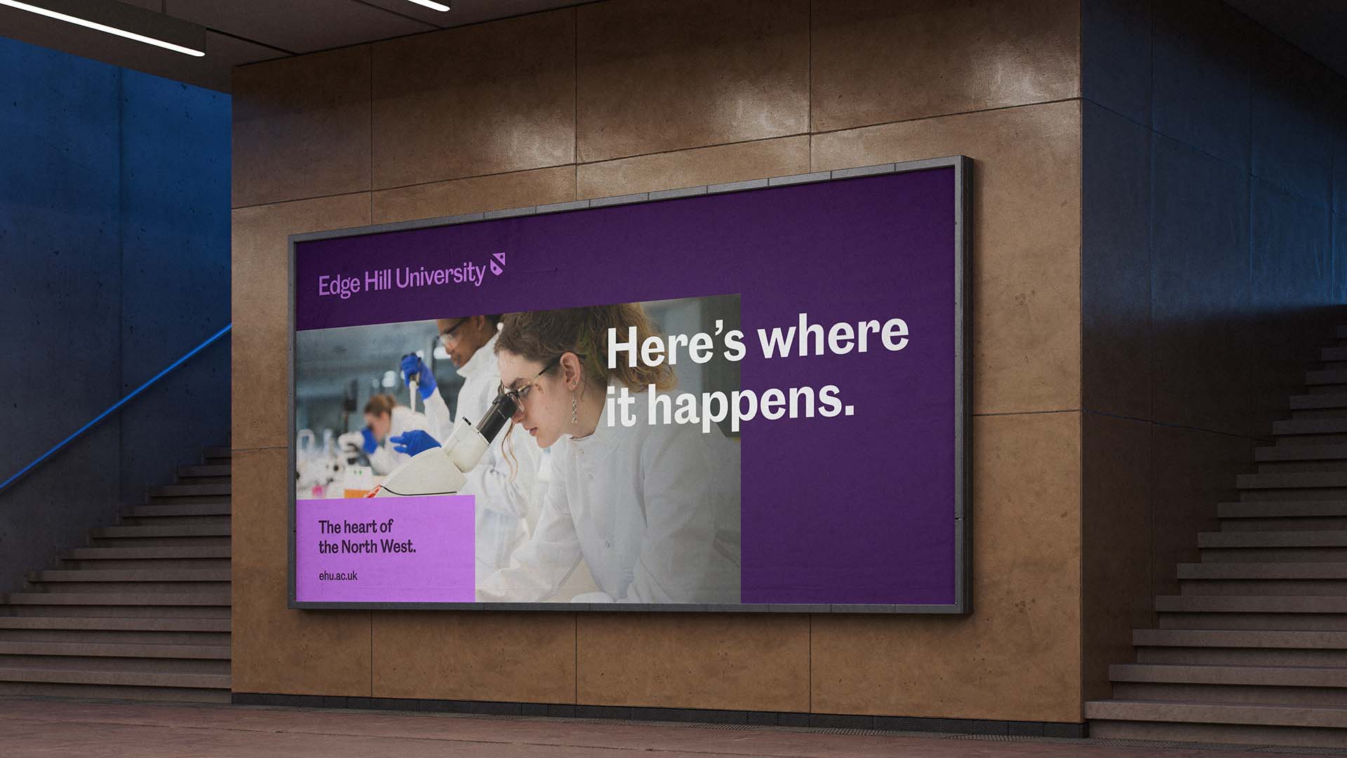
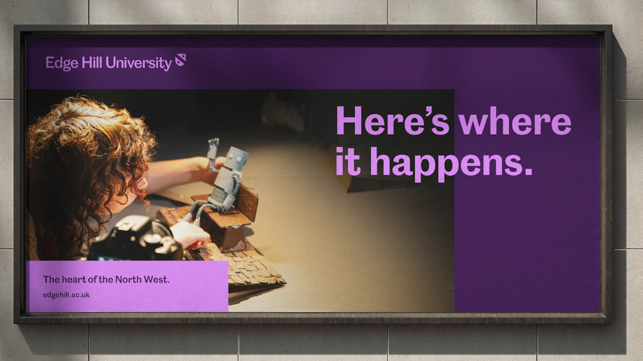
The heart of the North West
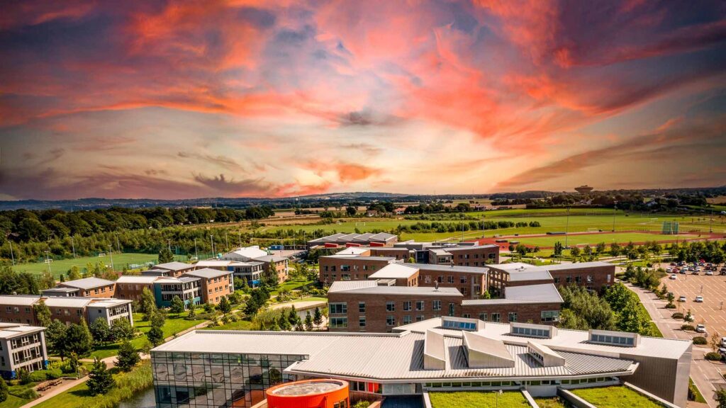
Today, Edge Hill is a university defined by action. We are rooted in the heart of the North West, yet ambitious in our reach. We connect students to real skills, real networks and real futures. We deliver excellence in teaching and research that transforms lives, strengthens society and creates impact locally, nationally and globally.
Our rebrand reflects this journey. Not a reinvention, but a progression. An evolution of our identity, not an erasure of our past. It builds on what has always made Edge Hill distinctive, expressing who we are today with greater clarity, confidence and ambition. A brand that honours our heritage while looking decisively to the future.
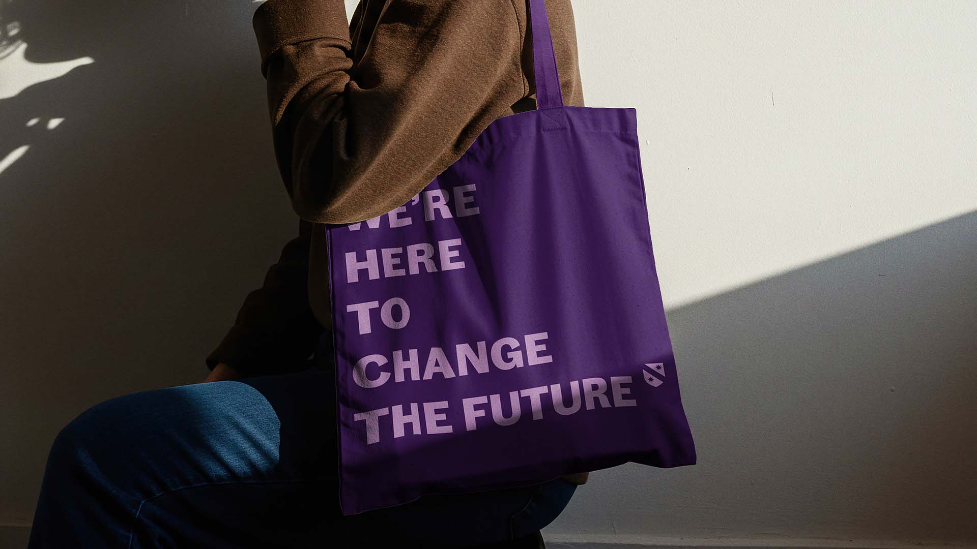
Because at Edge Hill, we don’t just believe in what’s possible. We make it possible.
Why we evolved our brand
Edge Hill has changed – and so has the world around us. Our students, partners and communities face complex global challenges that demand confidence, clarity and action. To meet that moment, our brand needed to do more than reflect who we’ve been; it needed to support who we are becoming.
This evolution gives Edge Hill a clearer, more confident voice. It allows us to communicate our purpose consistently, stand out in an increasingly competitive global landscape and express the scale of our ambition. All without losing what makes us distinctive.
This is not change for change’s sake. It is a progression that ensures our identity works as hard as we do.
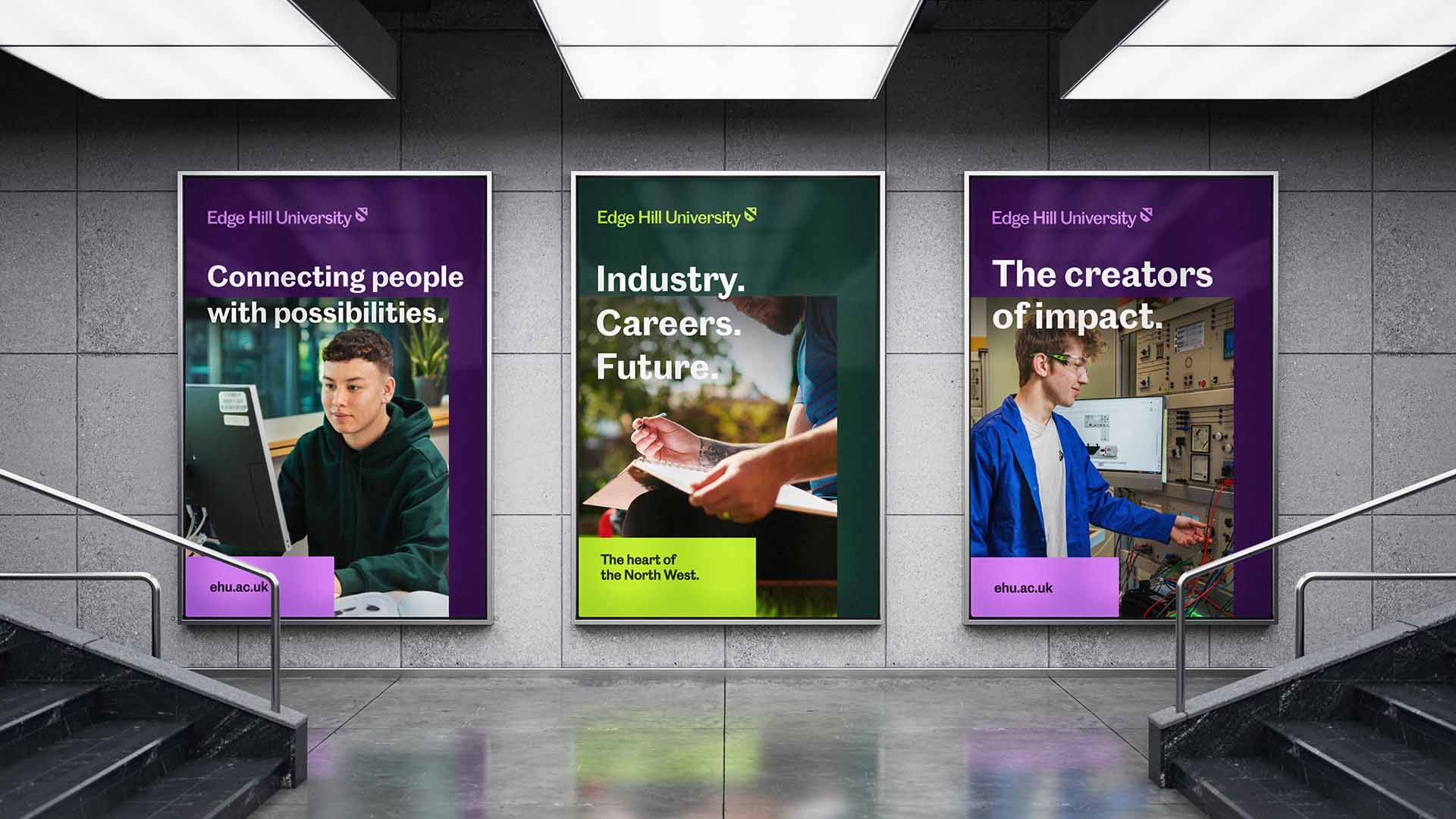
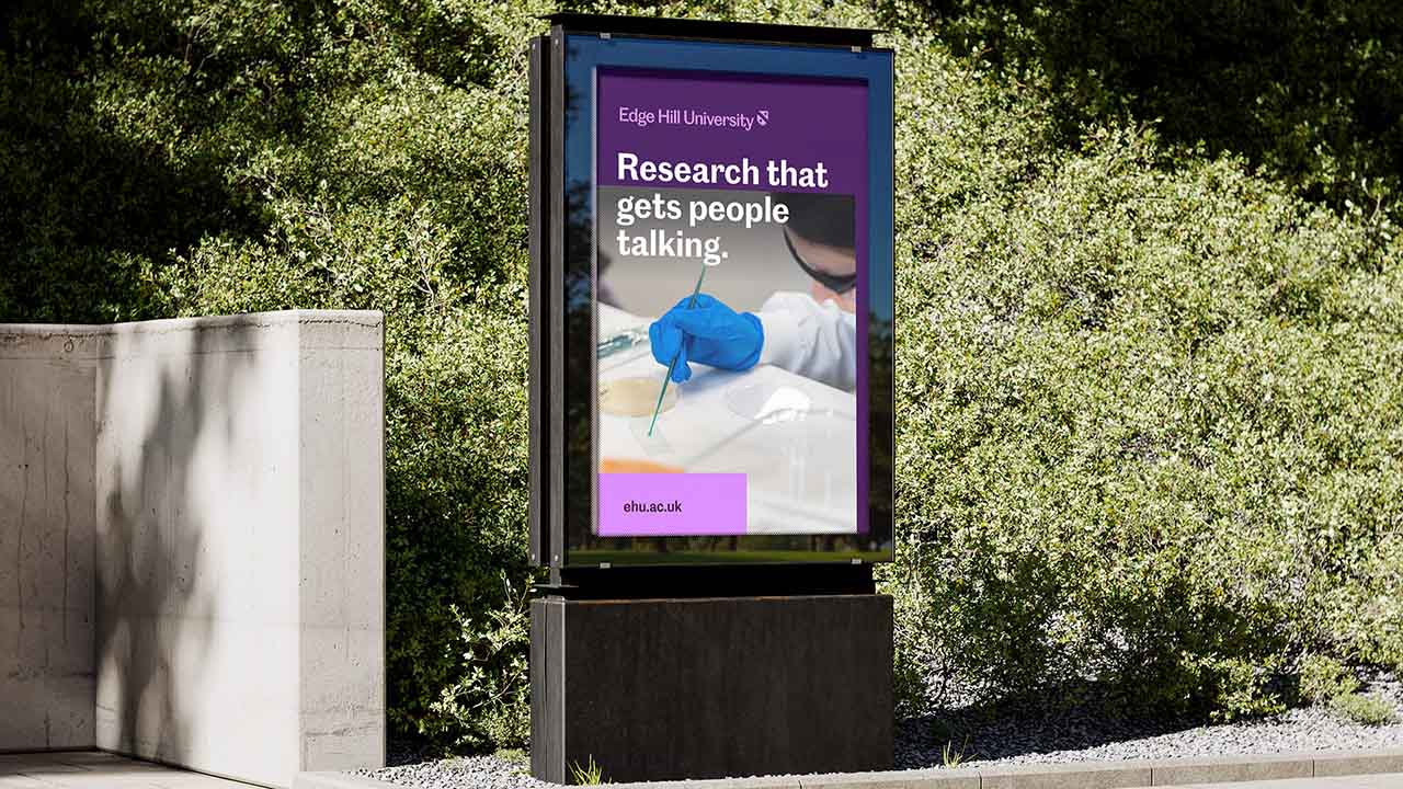
A brand designed for impact

Edge Hill has always believed that education should lead to real-world change. Today, that belief extends far beyond our campus.
Our refreshed brand positions Edge Hill as a university that is outward-looking, connected and globally engaged. It reflects our commitment to research that shapes society, teaching that equips students for real futures and partnerships that deliver meaningful impact.
This is a brand built to travel, confidently representing Edge Hill on a national and international stage while remaining deeply rooted in the communities we serve.
A refreshed identity
A logo that honours enlightenment and activism
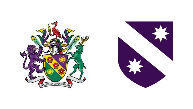
Our evolved logo builds on the legacy of Edge Hill’s historic crest. The suns remain – a symbol of enlightenment, education and the power of knowledge to illuminate new paths. Our original crest continues to be retained for ceremonial and formal occasions, preserving its place within our history and traditions.
The shield has been refined to create a clearer, more confident mark fit for modern digital and global use. Across it runs a diagonal sash, a subtle but deliberate reference to our suffragette roots. It represents activism, progress and the courage to stand for change.
Together, these elements create a symbol that respects our past while expressing a university that continues to move forward with purpose.
Typography with shared heritage: Caslon Doric
Our typeface, Caslon Doric, was established in the 19th century – around the same time Edge Hill was founded. As one of the earliest sans serif typefaces, it was a departure from convention: modern, functional and progressive in its thinking.
That spirit mirrors our own origins. Like Edge Hill, Caslon Doric challenged established norms and helped shape a new way forward. Today, it gives our brand a voice that is confident, contemporary and clear, while quietly connecting us back to our heritage.
It is a typeface that looks forward, grounded in where it came from.
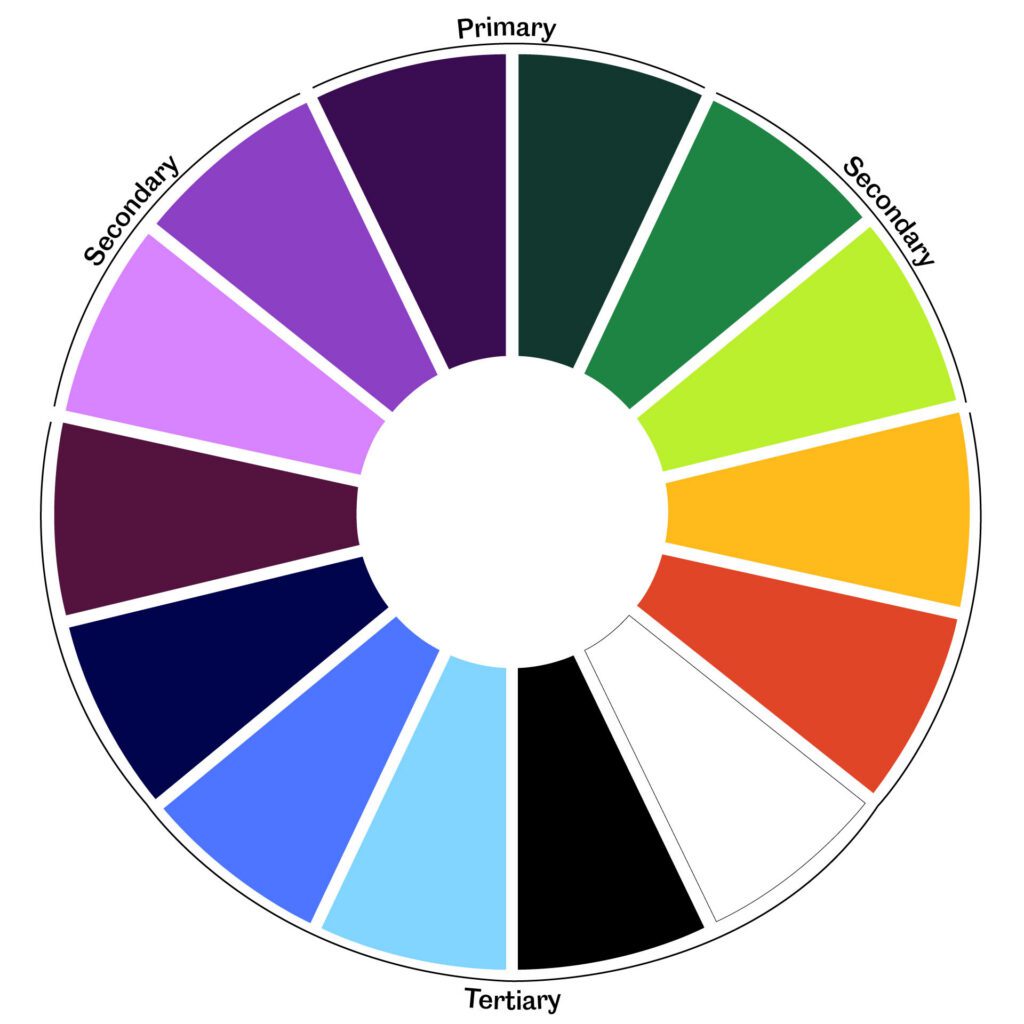
Colour inspired by progress and place
Our colour palette draws from two powerful sources: our history of social progress and the landscape that surrounds us.
The influence of the suffragette movement is present throughout the palette, a deliberate nod to our pioneering roots and our long-standing commitment to equity and opportunity. These colours have been reimagined for a modern context, bringing energy, flexibility and confidence to the brand.
Alongside this heritage, our palette reflects Ormskirk and the wider North West: low-lying agricultural land, a green and thriving campus, wide blue skies and the warm oranges of sunrise and sunset.
Together, these colours root Edge Hill in place while giving our identity warmth, vibrancy and momentum.