General tips
Some basic tips on how to edit pages, blocks and other settings.
Log in to WordPress
Visit www.edgehill.ac.uk/wp-admin and click the “Login using Edge Hill University SSO” button to open the WordPress dashboard.
Pages
New pages can be created on the WordPress dashboard via Pages > Add New. You can edit existing pages under Pages > All Pages and you’ll only be able to edit pages that you have access to.
If there’s any content that you should be able to edit and can’t, please get in touch with [email protected].
Useful editor settings


Blocks overview
Block editor basics video
Please note that not all features described in this video will be available to all user roles. Please email [email protected] if you need more information.
Adding a block
Access the list of available blocks by clicking the + icon at the top-left corner of the screen. You can also more quickly add a specific block by typing “/” on a new blank line and then the name of the block.
The Paragraph block is the default, so you can paste in some standard text and it will be added as a series of Paragraph blocks.
When copying and pasting text from an external source (like a Word document or webpage), be sure to paste your text as plain text, to remove any source formatting (font, size, colour etc). To do this, either press Ctrl+Shift+V on your keyboard or right-click and select “Paste as plain text”.
When copying links from emails, open them in a browser first and copy them directly from the address bar to avoid pasting safe links on a webpage.
Block patterns
Some blocks are formatted using a combination of the Column block and a specific content block, like EHU Card blocks. In these instances, we have created a block pattern, so that you can quickly add the layout without having to create it manually.
These can be accessed by clicking the + icon at the top-left corner of the screen and then the “Patterns” tab. The “Three Cards” block pattern is particularly useful and commonly used on landing pages.
Block styles, variants and options
Some blocks have alternative styles to control their formatting, as they can be used for different purposes. Standard Paragraph blocks use the “Default” block style by default, but the first line of introductory text on a page should use the “Intro Text” block style. You can access block styles in the Block sidebar on the right-hand side tab under “Styles”.
Groups of blocks
You can also group several blocks together, so that you can move and rearrange them more easily. Shift-select several blocks in the editor, click the three dots icon on the toolbar and select “Group”. You can then drag and drop the group in the List view sidebar.
Scheduling groups of blocks to show/hide
You can show or hide a group of blocks. Select the group, either in the block editor or the List view sidebar. Using the Block tab in the Settings sidebar on the right-hand side, scroll down to “Visibility”. Use the From/To controls to schedule when this group of blocks appears, or use the “Hide when schedule applies” toggle to control when they’re hidden.
Anchor links
You may want to link people directly to a specific part of your webpage. To do this, you’ll need to create a HTML anchor first. Click any heading or paragraph on your page to select it. In the Block settings sidebar on the right-hand side, click “Advanced” and enter a single-word, lowercase phrase into the “HTML Anchor” textbox. You can then link to that section of your webpage like this: https://www.edgehill.ac.uk/page-name#anchor-name. For example, click the following link to return to the block editor video on this page.
As with all links, make sure that your link text is descriptive and not just “click here” or “find out more”. Use phrases like “Return to the block editor video” or “Download the application form” etc.
Images
Alternative text
Any image that’s uploaded to the media library needs to have alternative (alt) text describing its purpose, unless it’s purely decorative. Check out this useful guide to help you decide if an image is decorative or if it needs alt text.
It’s important that all content published on our website is fully accessible. View our “Accessibility – The Basics” course for more information.
Accepted resolutions
All images uploaded to the media library should have a 16:9 aspect ratio. The only exception is staff and student profile images, that can have a 1:1 aspect ratio. Recommended resolutions are detailed below:
| Aspect ratio | Dimensions |
|---|---|
| 16:9 | 1920 x 1080px |
| 1:1 | 1080 x 1080px (only for staff or student profile photos) |
File sizes
All images uploaded to the media library should be less than 300kb and 500kb max. Busier images might need to be larger to not look compressed when used in an EHU Cover block, but there will be few instances where images need to be larger than 500kb.
Please email [email protected] if you need to upload a large image or need guidance on how to resize and compress images using Photoshop.
Taxonomies
We’ve set up several taxonomies to describe the content of standard pages. These should be populated using the existing fields, if you require new fields to be added please contact the Digital Content team.
Taxonomies can be populated by checking the relevant box under the audience, topic or content type heading in the Settings sidebar on the right-hand side.
Event specific taxonomies
News specific taxonomies
In addition to the above and if applicable, you can relate a piece of content with one or more departments and/or subject areas.
| Description | |
| Related Department | Academic or non-academic department associated with this content (if applicable). |
| Related Subject | Academic subject associated with this content (if applicable). |
Section menus and quick links
Please note that not all users have access to this feature. Please email [email protected] if you need to update the navigation menu or quick links on your section of the website.
Separate areas of the website need their own section menus. These appear below the header and above the breadcrumb bar on desktop:
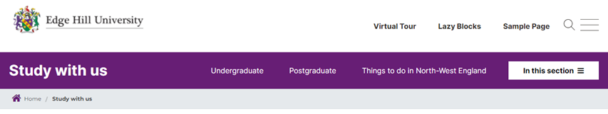
There are two customisable menus for each section – one for navigation menus (the hamburger “In this section ≡” menu) and another, optional menu for quick links (Undergraduate, Postgraduate etc). These can be edited manually in Navigation > Menus. Follow the naming conventions, “<site-name> section” and “<site-name> quick links”, respectively eg “Biology section” and “Biology quick links”.
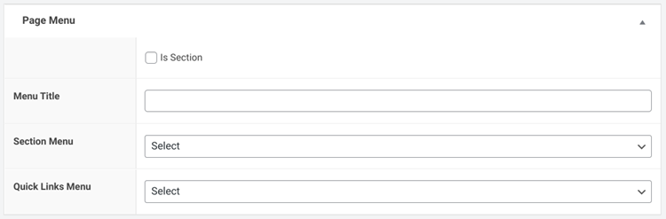
To attribute a pair of section menus to a homepage, scroll below the block editor section to find the Page Menu area. Click the “Is Section” checkbox and select the relevant “Section” and “Quick Links” menus from the drop-down menus:
Any child pages will inherit the menus of their parent section, so it’s important to set the Parent page correctly.
Section and Quick Links menus can be defined in Appearance > Menus on the main dashboard.