Available blocks (old)
Cover/hero image
EHU Cover block
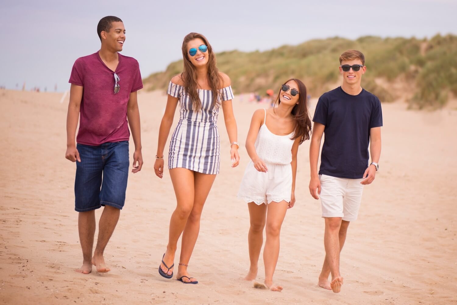
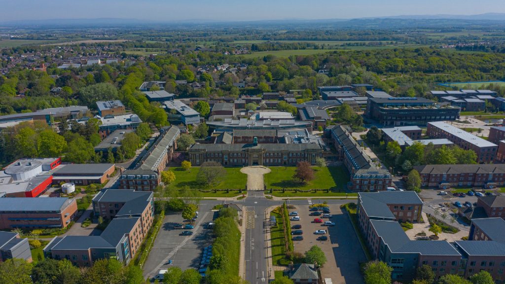
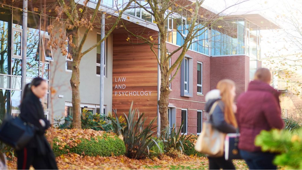
Add an EHU Cover block to the top of your page if you want a large banner image. Reserve for landing pages/top-level category pages.
You can also change the width of the EHU Cover block – None (1200px), Wide width (100%) and Full width. Wide width or None are generally preferred.
You should manually add the title of your page to the EHU Cover block and check the “Hide Page Title” checkbox at the bottom of the Page sidebar. You can also supply text to appear before (“Pre Title”) and after the title (“Subtitle”). Reserve pre-text for a label (eg “Department”) and the text after for a very short summary or qualifying text. Site-specific CTAs can appear here as well, eg “Book an open day”.
Examples
Width: None
- Image size: 1280 x430px

Width: Wide width
- Image size: 1400 x 430px
Width: Full width
- Image size: 100% x 430px
Unlike other blocks, the width of an EHU Cover block (None, Wide or Full) is selected in the right-hand column Block sidebar.
Intro text
Paragraph block (Intro Text block style)
Most pages will benefit from intro text, where the first paragraph is slighter larger than standard body text and helps explain the purpose of the page.
Example
Aenean cursus tellus eu condimentum eleifend. Integer lacinia quam at imperdiet fringilla. Morbi ut blandit lectus. Duis sit amet diam eget dui facilisis tincidunt scelerisque pulvinar sem.
Paragraph
Paragraph block (Default block style)
When you type or copy text into the editor, it will be created using the standard Paragraph block. Be careful when copying and pasting text from other sources. Paste by using ctrl + shift + v to insert the text without formatting and/or paste it into a program like Notepad first to remove any styling.
Example
Aenean cursus tellus eu condimentum eleifend. Integer lacinia quam at imperdiet fringilla. Morbi ut blandit lectus. Duis sit amet diam eget dui facilisis tincidunt scelerisque pulvinar sem. Mauris mattis, nisi nec placerat vulputate, eros odio pulvinar augue, laoreet pretium leo eros sit amet lacus. In tempus odio urna, sit amet accumsan risus placerat id. Fusce congue justo vel commodo hendrerit. Nullam consequat augue ut molestie ultrices. Praesent orci velit, pulvinar id pellentesque in, aliquam sed metus.
Headings
Heading block
The in-page navigation menu appears on most pages and indexes all Heading 2s that appear on the page. Be sure to use properly organised and nested heading styles to make sure that this works correctly.
Heading 3 example
Aenean cursus tellus eu condimentum eleifend. Integer lacinia quam at imperdiet fringilla. Morbi ut blandit lectus. Duis sit amet diam eget dui facilisis tincidunt scelerisque pulvinar sem. Mauris mattis, nisi nec placerat vulputate, eros odio pulvinar augue, laoreet pretium leo eros sit amet lacus. In tempus odio urna, sit amet accumsan risus placerat id. Fusce congue justo vel commodo hendrerit. Nullam consequat augue ut molestie ultrices. Praesent orci velit, pulvinar id pellentesque in, aliquam sed metus.
Heading 4 example
Aenean cursus tellus eu condimentum eleifend. Integer lacinia quam at imperdiet fringilla. Morbi ut blandit lectus. Duis sit amet diam eget dui facilisis tincidunt scelerisque pulvinar sem. Mauris mattis, nisi nec placerat vulputate, eros odio pulvinar augue, laoreet pretium leo eros sit amet lacus. In tempus odio urna, sit amet accumsan risus placerat id. Fusce congue justo vel commodo hendrerit. Nullam consequat augue ut molestie ultrices. Praesent orci velit, pulvinar id pellentesque in, aliquam sed metus.
Group of blocks
The Group block is a block that groups other blocks together inside one container. Think of it as a “parent” block that can hold multiple “child” blocks within it.
One popular use is to group together several blocks and apply a background colour to distinguish it visually. Use in conjunction with the Column block to arrange an image next to a Heading, paragraph and EHU Button, as below.
You can also change the width of a Group of blocks – None (1200px), Wide width (100%) and Full width.
We recommend that you use the standard blocks before attempting to use group blocks to create different layouts. Most layouts should be possible using the established blocks.
Examples
Width: None

Lorem ipsum
Lorem ipsum dolor sit amet, consectetur adipiscing elit. Vivamus consectetur cursus dolor. Quisque fermentum dui nibh, vitae viverra lorem euismod sit amet. Maecenas ligula nibh, suscipit iaculis lectus quis, convallis vehicula enim. Sed neque erat, mattis vitae accumsan molestie, eleifend sit amet leo. Vivamus et eros sit amet turpis sodales ornare. Aenean malesuada iaculis justo, vel imperdiet metus convallis ac. Vestibulum scelerisque volutpat maximus. Fusce vel sapien et nisl pellentesque ultricies non vel justo. Aenean ut metus laoreet tellus tincidunt aliquet.
ClickWidth: Wide width
Lorem ipsum
Lorem ipsum dolor sit amet, consectetur adipiscing elit. Vivamus consectetur cursus dolor. Quisque fermentum dui nibh, vitae viverra lorem euismod sit amet. Maecenas ligula nibh, suscipit iaculis lectus quis, convallis vehicula enim. Sed neque erat, mattis vitae accumsan molestie, eleifend sit amet leo. Vivamus et eros sit amet turpis sodales ornare. Aenean malesuada iaculis justo, vel imperdiet metus convallis ac. Vestibulum scelerisque volutpat maximus. Fusce vel sapien et nisl pellentesque ultricies non vel justo. Aenean ut metus laoreet tellus tincidunt aliquet.
ClickWidth: Full width
Lorem ipsum
Lorem ipsum dolor sit amet, consectetur adipiscing elit. Vivamus consectetur cursus dolor. Quisque fermentum dui nibh, vitae viverra lorem euismod sit amet. Maecenas ligula nibh, suscipit iaculis lectus quis, convallis vehicula enim. Sed neque erat, mattis vitae accumsan molestie, eleifend sit amet leo. Vivamus et eros sit amet turpis sodales ornare. Aenean malesuada iaculis justo, vel imperdiet metus convallis ac. Vestibulum scelerisque volutpat maximus. Fusce vel sapien et nisl pellentesque ultricies non vel justo. Aenean ut metus laoreet tellus tincidunt aliquet.
ClickCard
EHU Card block INSIDE Column block
The EHU Card block should typically appear in a Column block layout, rather than as a full-width element, so these blocks are nested inside the Column block.
Cards are typically used to link to sub/child pages, but don’t have to link to anything,
You can also change the width of the Column block – None (1200px), Wide width and Full width.
Examples
Width: None
Width: Wide width
Width: Full width
Call to Action (CTA) button
EHU CTA block
If you have a single call-to-action that you want to highlight, you can use the EHU CTA block.
Example
Title of CTA
Subtext to accompany CTA
If you want to include a group of related calls-to-action without subtext, you can use the EHU Buttons block.
Example
Button 1 Button 2 Button 3Expanding boxes
EHU Expanding Box block
You can add a title and any blocks to the content nested inside the EHU Expanding Box block. It might be easier to use the List view button to keep track of which blocks are inside – you can drag and drop to move them round and change the order. You can change the width of the block and put it inside a group to add a background colour as well.
Examples
Issues with this block:
- No facility to change title heading level.
- Content after EHU Expanding Box block wraps (would require Spacer block added manually to display correctly)
Numbered steps or USPs/key stats panel
EHU Number Block INSIDE Column block
1st
Winner
Aenean cursus tellus eu condimentum eleifend. Integer lacinia quam at imperdiet fringilla. Morbi ut blandit lectus. Duis sit amet diam eget dui facilisis tincidunt scelerisque.
2nd
Silver medal
Mauris mattis, nisi nec placerat vulputate, eros odio pulvinar augue, laoreet pretium leo eros sit amet lacus. In tempus odio urna, sit amet accumsan risus placerat id.
3rd
Bronze medal
Fusce congue justo vel commodo hendrerit. Nullam consequat augue ut molestie ultrices. Praesent orci velit, pulvinar id pellentesque in, aliquam sed metus.
Issues with this block:
- No link target option (not essential but would be good to know if we’re going to get it)
- No facility for icons (can use FontAwesome Link block instead)
- Can’t change title heading level
Icon buttons or panel
EHU Icon Panel block (to be renamed)
Use this block if you want to include Font Awesome icons and text in a card or panel layout. You can optionally include subtext and a link for each icon. You don’t need to combine this block with columns to arrange several on a single row. You can (currently) change the size of the icon in the Block tab of the Settings sidebar on the right-hand side, by typing fa-1x up to fa-10x. The panel slider lets you change the layout from a small button to a larger panel too:
Is panel = no
Is panel = yes
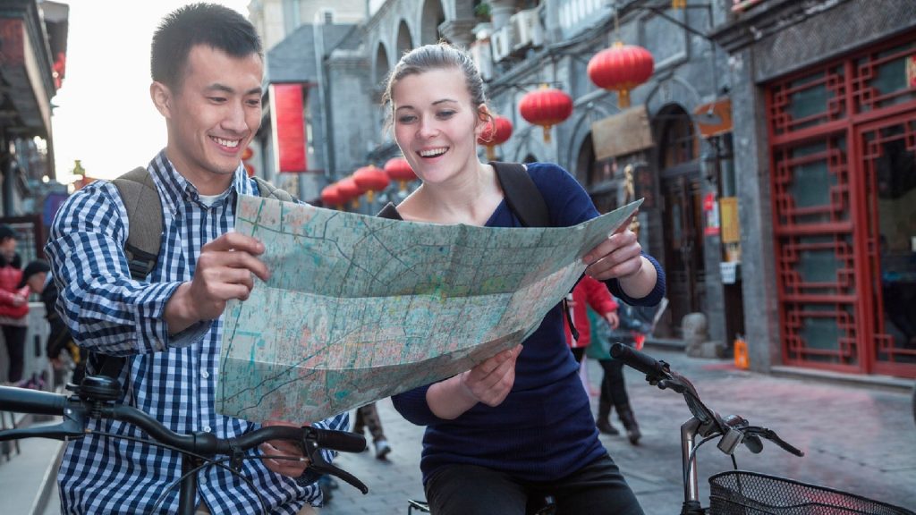
Promo panel
EHU Promo Panel
Use this block to promote a single item or activity as a highly visible, full-width panel. You can adjust the ratio of image to content and align the image on the left or right side as needed in the Block tab of the Settings sidebar on the right-hand side.
The best way to get a feel for Edge Hill is to see it for yourself. Aenean cursus tellus eu condimentum eleifend. Integer lacinia quam at imperdiet fringilla. Morbi ut blandit lectus. Duis sit amet diam eget dui facilisis tincidunt scelerisque pulvinar sem. Mauris mattis, nisi nec placerat vulputate, eros odio pulvinar augue, laoreet pretium leo eros sit amet lacus. In tempus odio urna, sit amet accumsan risus placerat id. Fusce congue justo vel commodo hendrerit. Nullam consequat augue ut molestie ultrices. Praesent orci velit, pulvinar id pellentesque in, aliquam sed metus.
Book an Open Day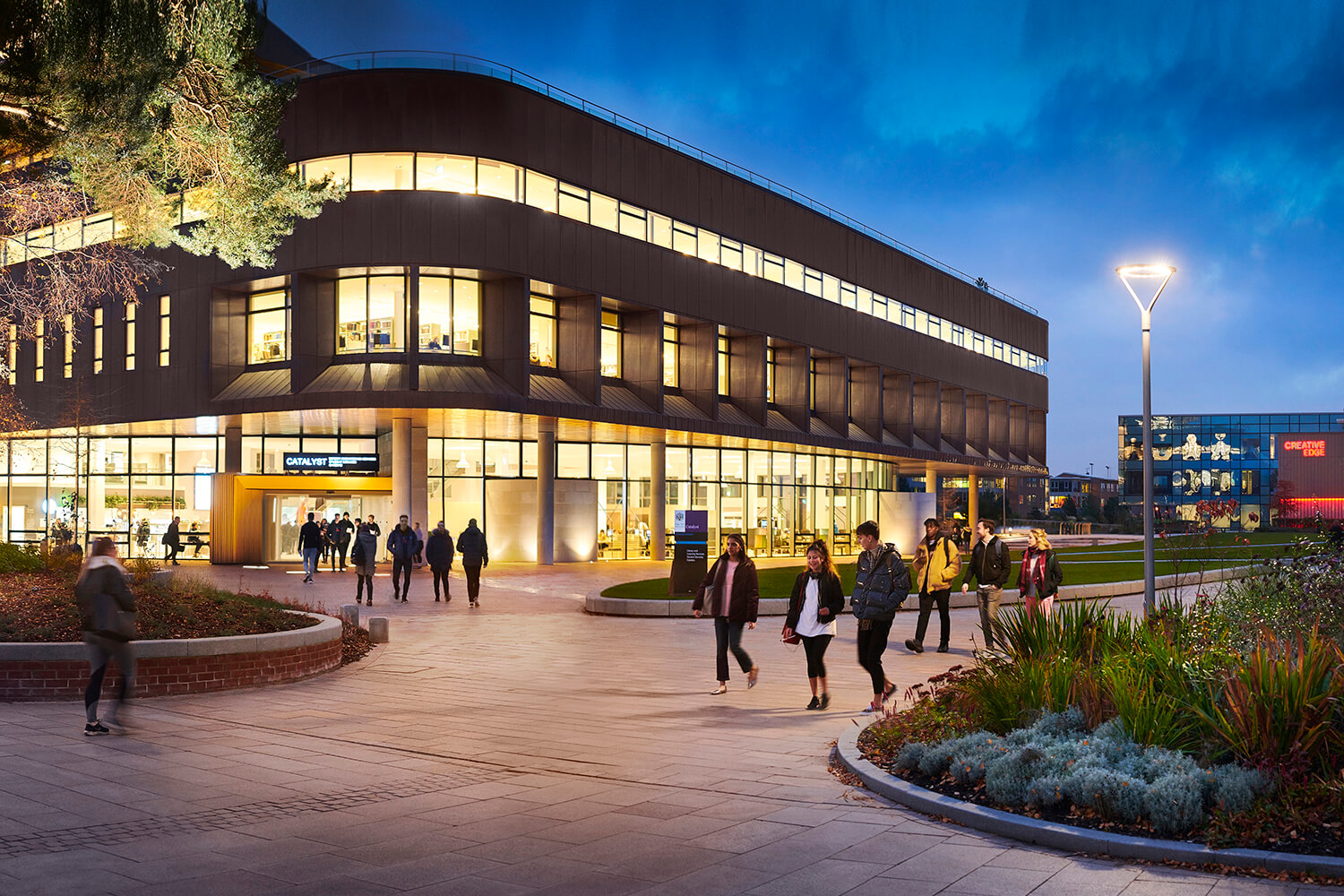
The best way to get a feel for Edge Hill is to see it for yourself. Aenean cursus tellus eu condimentum eleifend. Integer lacinia quam at imperdiet fringilla. Morbi ut blandit lectus. Duis sit amet diam eget dui facilisis tincidunt scelerisque pulvinar sem. Mauris mattis, nisi nec placerat vulputate, eros odio pulvinar augue, laoreet pretium leo eros sit amet lacus. In tempus odio urna, sit amet accumsan risus placerat id. Fusce congue justo vel commodo hendrerit. Nullam consequat augue ut molestie ultrices. Praesent orci velit, pulvinar id pellentesque in, aliquam sed metus.
Book an Open DayIssues with this block:
- No facility to change width
- CTA button is mandatory ATM
- Video doesn’t work
Image gallery
Gallery block

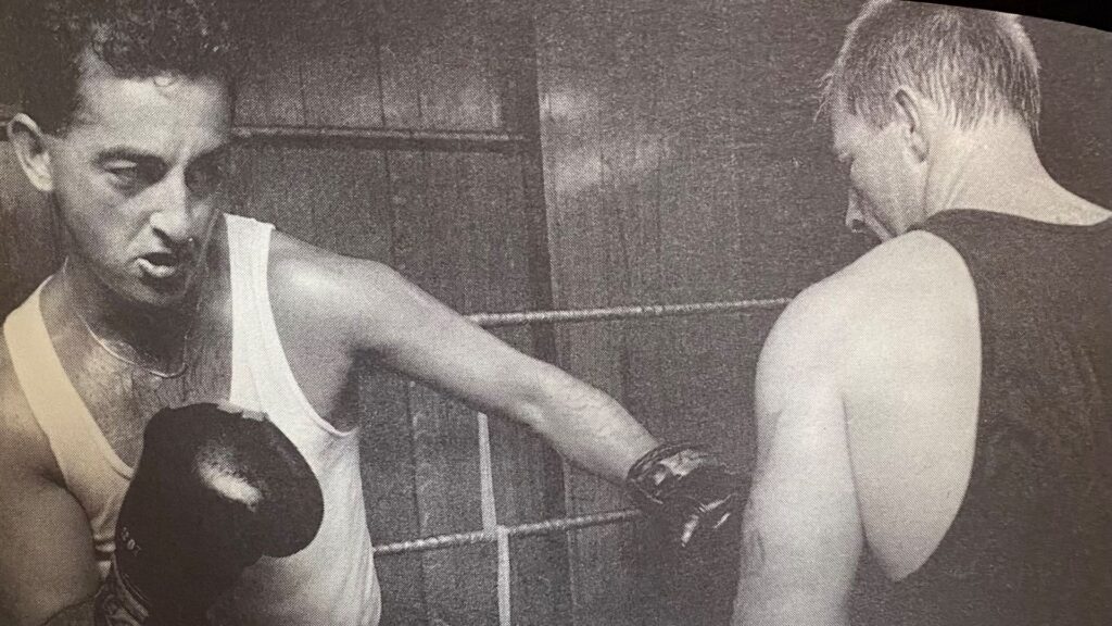
Timeline
EHU: Timeline block
Edge Hill Founded
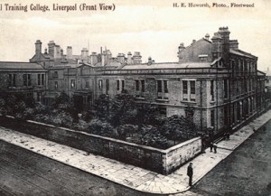
On 7 February 1882 seven Liverpool businessmen and philanthropists – Alexander Balfour, Thomas Matheson, Samuel Smith, William Crosfield, W P Sinclair, S McDairmid and S G Rathbone – founded Edge Hill College.
A large house on Durning Road in the Edge Hill district of Liverpool was adapted and formally opened on 24 January 1885, welcoming 41 new students.
Sarah Jane Yelf
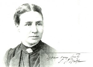
Sarah Jane Yelf was appointed as the College’s first Principal, with the intention of producing ‘a superior class of Elementary School Mistresses’.
Sarah Jane Hale
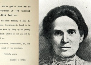
Sarah Jane Hale, took over as principal just as the College began to grow. The premises were enlarged in 1903 when a new wing, including three new classrooms, two laboratories and a gymnasium, was opened. By 1905, student numbers had risen to 160.
The end of an era
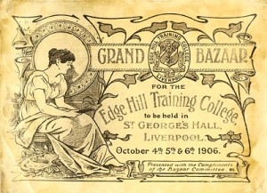
Miss Hale died in 1920, and by the end of her tenure, the College had come a long way. It had trained 2,071 girls of whom 213 were Head Mistresses, 178 First Assistants, and 30 science mistresses
Announcement
EHU Announcement
This is an announcement!
Tabs
Tab Content block WITH Tab Headings block
Use this block for in-page tabbed content. Make a note of the page if you use this block and want vertical tabs rather than horizontal – this will be need to be addressed with a block style at a later date.
Praesent tincidunt, tellus in tempor commodo, nulla arcu pharetra dolor, non gravida nisi ipsum accumsan sapien. In nec tortor nec neque condimentum pharetra. Aliquam mauris magna, semper at dolor venenatis, rhoncus ullamcorper felis. Morbi vehicula mattis purus quis facilisis. Aenean at augue consequat, consectetur purus at, pulvinar erat. Ut ac tristique orci. Morbi vitae fringilla mi. In hac habitasse platea dictumst.
Aenean cursus tellus eu condimentum eleifend. Integer lacinia quam at imperdiet fringilla. Morbi ut blandit lectus. Duis sit amet diam eget dui facilisis tincidunt scelerisque pulvinar sem. Mauris mattis, nisi nec placerat vulputate, eros odio pulvinar augue, laoreet pretium leo eros sit amet lacus. In tempus odio urna, sit amet accumsan risus placerat id. Fusce congue justo vel commodo hendrerit. Nullam consequat augue ut molestie ultrices. Praesent orci velit, pulvinar id pellentesque in, aliquam sed metus.
Cras vitae libero vehicula, tincidunt velit non, tincidunt magna. Maecenas pretium lorem sed gravida sollicitudin. Sed semper lacus orci, commodo gravida urna scelerisque nec. Etiam quam lorem, euismod at eleifend vel, sodales sit amet ipsum. Nulla tincidunt metus sapien, dapibus congue odio pharetra sed. Integer quis lacus nulla. In suscipit nulla vel urna venenatis convallis et et orci. Suspendisse dapibus, odio id finibus tempus, sem dolor faucibus risus, nec semper quam nibh et lacus. Cras id finibus quam, ac blandit leo. Suspendisse non sem congue justo sagittis mattis vel eget nunc. Aliquam pulvinar nisi ac lorem condimentum dapibus. Curabitur condimentum, mauris rhoncus accumsan placerat, dui lorem dapibus nisl, non cursus nisl risus sit amet turpis. Fusce metus odio, molestie quis ultricies quis, aliquet sed sem.
Issues with this block:
- Content only appears on-page when you click the headings. TOGGLE ADDED TO OPEN AS DEFAULT
Table
Table block
There are two block styles – the Stripes style (pictured below) is more aesthetically pleasing, but both may be replaced with standard styles at a later date.
| Heading label | Heading label |
|---|---|
| Data | Data |
| Data | Data |
| Footer label | Footer label |
List with column styles
- Curabitur cursus nunc sed venenatis feugiat.
- Sed in ipsum sollicitudin, suscipit elit nec, molestie risus.
- Nunc quis risus nec tellus molestie volutpat in non lacus.
- Maecenas rhoncus sapien vitae turpis blandit fringilla.
- Morbi egestas est nec massa eleifend commodo.
- Aenean at dolor id mi facilisis ultrices sit amet ac urna.
- Lorem ipsum dolor sit amet, consectetur adipiscing elit.
- Nulla dapibus metus ac lorem vestibulum venenatis.
- Sed a turpis vel velit scelerisque feugiat at eu ex.
- In imperdiet metus id vestibulum vulputate.
- Praesent quis arcu non lacus tincidunt bibendum.
- Pellentesque pharetra nulla a justo molestie ultrices.
- Nulla ultrices velit id vestibulum aliquet.
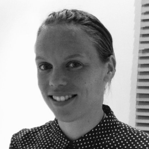
Profile quote block
EHU Quote block
Select and present a specific Quote (associated with a Profile) that has been uploaded to the website.
Issues with this block
- Currently pulls in news posts rather than quotes – outputs post ID.

Courses list block
EHU Courses List block
Use this block to present a list of courses for a department or subject area. You can also manually select individual courses to include in a “You may also be interested in” list.
Issues with this block:
- Padding above list.
- Page can’t be updated if block is used.
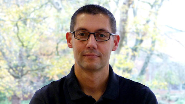
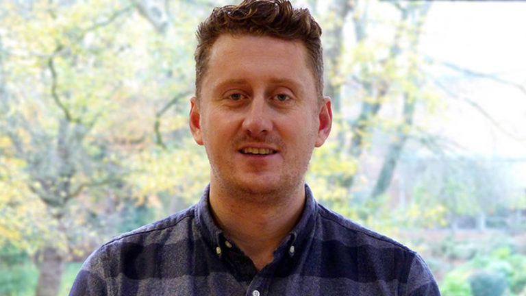
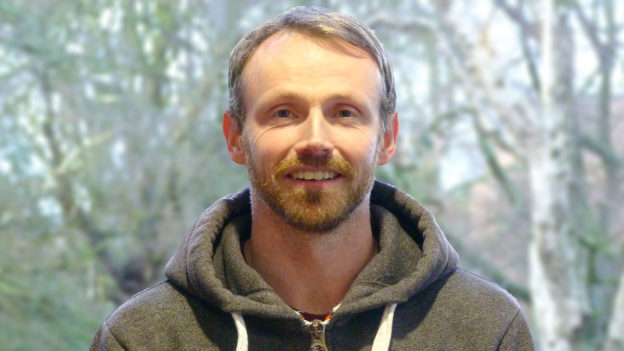
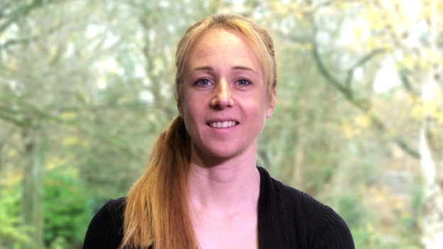
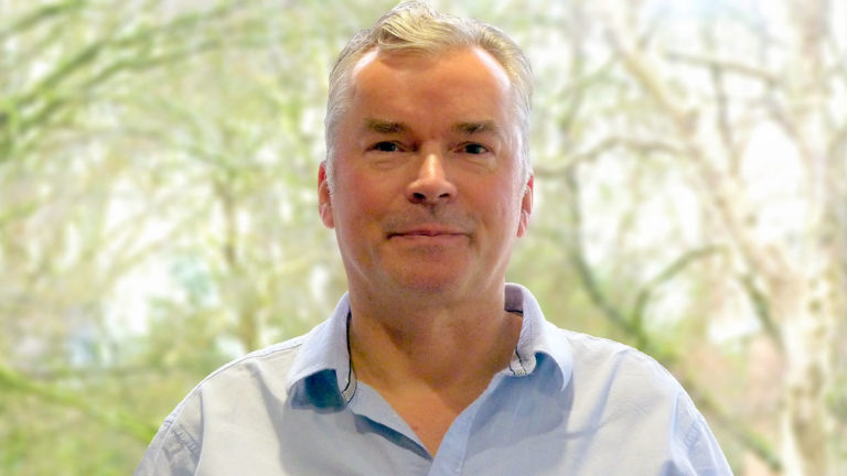
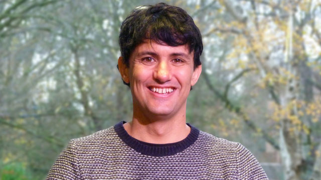
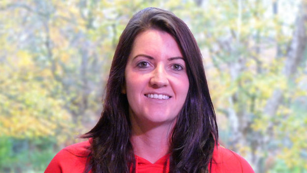
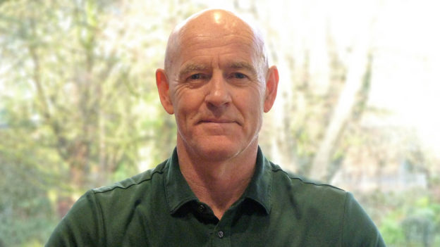
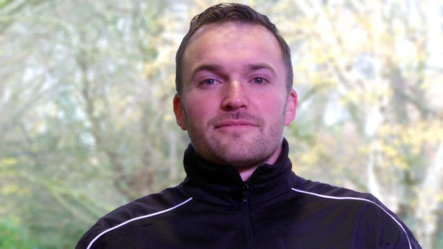
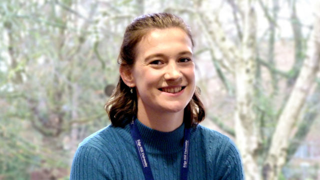
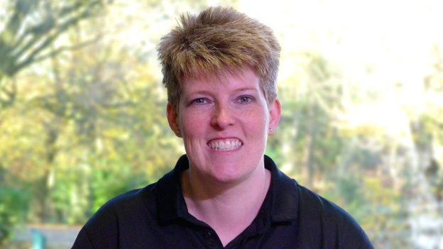
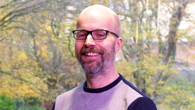
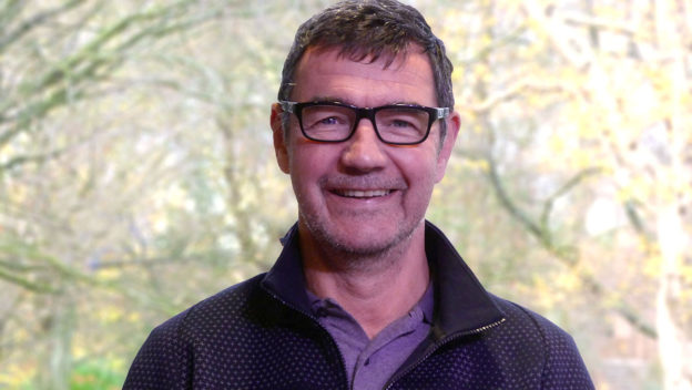
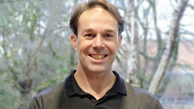
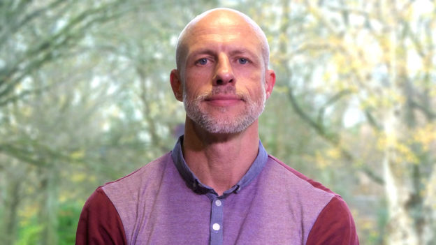
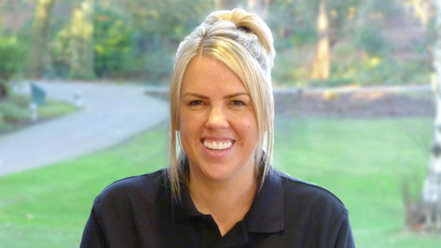
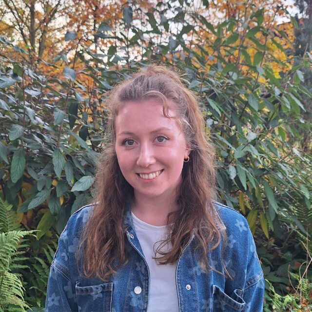
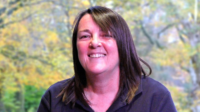
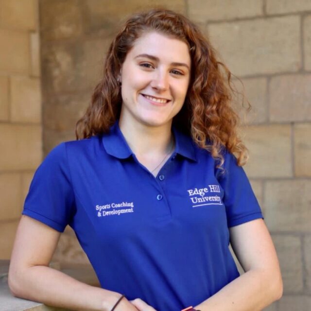
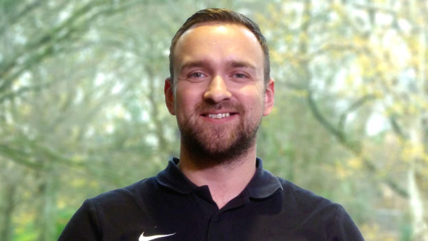
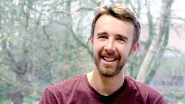
Profiles list/grid block
EHU Profiles List block
Sport & Physical Activity


Media & Text
Media & Text block
Default text size (too large)
Standard paragraph text
Issues with this block:
- Default width (“Wide width”) will be too large in most if not all instances. Should be “None”.
- Default text size is too large – should be standard paragraph text size (currently fixed by changing block from Paragraph to Heading and back to Paragraph).
News list/grid block
EHU News List block
EHU News List


Staff/student profiles list/grid block
EHU Profiles List block